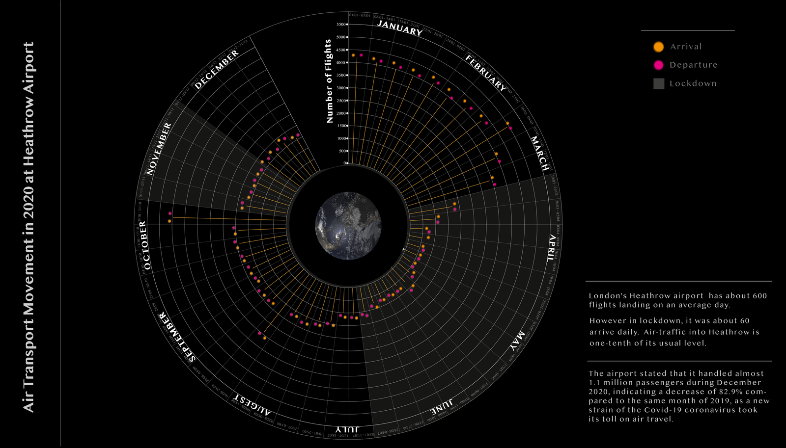
Data Visualization of Air Transport Movements at Heathrow Airport in 2020.
Duration
3 Weeks
Role
Solo
Overview
The visualisation aims to identify how the aviation industry, especially at Heathrow, was affected by the pandemic. I wanted to understand how COVID-19 impacted airports. Some airports were at risk of closure due to the loss of business. Heathrow Airport typically has about 600 flights landing on an average day, but during the lockdown, only about 60 flights arrived daily. Air traffic into Heathrow was reduced to one-tenth of its usual level.
Challenges
The challenges were collecting the data and presenting it in a visualization. Most of the data I obtained came from Heathrow Airport’s website, where they provide monthly data on arrivals and departures. I wanted to make the visualisation easy to read and ensure it effectively illustrates how the pandemic affected the aviation industry.
Research
The first set of restrictions contributed to a $229 million loss for the six months leading up to September, as passenger numbers fell by 80%. In the week before the UK went into lockdown, 2,432 flights were tracked departing the airport by Flightradar24, while last week there were just 464.
Some airports were at risk of closure because of the loss of business during the coronavirus pandemic. Nine out of ten flights have been grounded since the UK went into lockdown.
Problem solved
It was complicated to fit the entire year into the visualization. To make it easier to read and understand, I divided the months into weeks, which made it easier to plot the arrivals and departures within each week.